You wouldn’t believe how many things we’ve got going on. As we make the transition from employees to owners, we are pulled in so many exciting directions. Each new day is proving to be unique. One day you’re calling it an office day, slipping on your sandals and having vendor meetings and fast food. The next day you’re in heels presenting the details of fabrics and trims to a drapery client who is excited for bold and brave patterns. The day after that you’re in leggings and chucks at the top of a ladder painting the walls of your vignette.
These are exciting times and we are pushing full force ahead to make sure each of these details get done. We especially like having the time, because of the variety in our schedule, to create policies and procedures for us that allow us to value the client’s time and focus on creating unique and beautiful spaces for them. What gets us excited about the progress of the space, is having our client experience the best parts of the studio. Now let’s get you all caught up!
It’s A New Day & I’m Feeling Good
Sometimes putting up walls can be a good thing
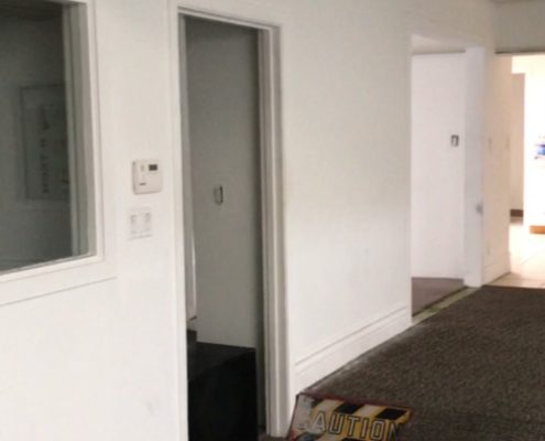
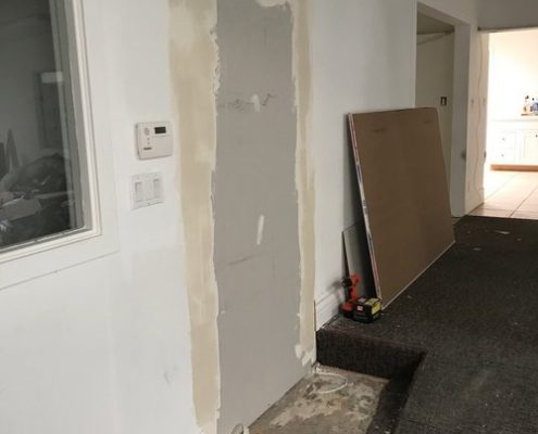
Tearing down walls is one of the most exciting parts of a renovation! We’ve been so excited to demo some of the biggest walls in our new space, allowing for amazing light and sight lines throughout. We understand and appreciate how grand a space can be when you tear through the barriers and open it up. These days, however, we’re finding more reason to close some doors up, and minimize some openings to allow for more private spaces where we desire. In an earlier post, I showed you how we closed off the entrance to the tester room, but now we moved on over to The Shoppe.
There were two entrances going to the shop. Closing one off allows for a more intimate shopping experience and allows us to control the flow of the space. Once the wall is clean and painted, we now have more wall space on the lobby side to display beautiful pictures of our past projects for clients to be inspired by. Also with the door gone, we’re able to push the step back a few feet to make the now only entrance to the shop, a beautiful feature.
 |  |  |
Build Em Up
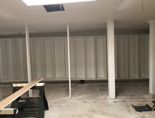
We focused the first phase of our studio design to the Material & Presentation Rooms. These spaces are the heart of the studio because it’s where we create and show the client our work. I’ve seen quite a few material rooms in my time and I cannot stress how important organization is. If you can start organized, it’s much easier to stay that way! So we had to consider what was the easiest, most cost effective and still most aesthetically pleasing way to organize all of our fabric & books, hard materials and samples.
A lot of designers need something clean and beautiful that can withstand wear and tear. Most designer head to the same product. Introducing the Kallax Shelf Unit from Ikea. We were prepared to join the ranks and buy a couple of these bad boys. Instead we had some custom stuff made instead. When you’re starting a business, custom is synonymous with the bankroll sound. We had to be cautious to make sure we didn’t rack up a crazy bill.
Fortunately, we lucked out with the amazing cabinet builders at Builder Boy. We were able to get an amazing quote back to do all of the built-ins and two custom presentation tables! While custom units look similar, we paid less. We were also able to get adjustable shelves which allow us to cater to oddly shaped or oversized books. Needless to say, we felt pretty smart getting more for less. We were pretty excited when they started to bring them up. Still need a few more pieces, but it’s happening!
 |  |


 Satin and Slate Interiors